• Home
  • About
  • Our Approach
    • A Kitchen Reimagined
    • Good Bye City Life!
    • Mid Century Modern in a Traditional Colonial
    • From Boring to Nautical Chic
    • Finding our way back after Sandy
    • Phoenix Room
    • Tiny Kitchen Big Changes
    • To Sea or Not to Sea
  • Industry Notes
  • FAQs
  • Contact
Menu

Chrysaliz Design

  • Home
  • About
  • Our Approach
  • Case Studies
    • A Kitchen Reimagined
    • Good Bye City Life!
    • Mid Century Modern in a Traditional Colonial
    • From Boring to Nautical Chic
    • Finding our way back after Sandy
    • Phoenix Room
    • Tiny Kitchen Big Changes
    • To Sea or Not to Sea
  • Industry Notes
  • FAQs
  • Contact

Subscribe!

Sign up with your email address to receive occasional news and updates from Chrysaliz Design

We respect your privacy.

Thank you!

"...I wanted to let you know that the entire area turned out to be functional, beautiful, and exactly as I had envisioned when I first started thinking about remodeling." - D.B.

Featured posts:

Featured
Oct 4, 2018
Spontaneous Glass Breakage: Danger and Protection
Oct 4, 2018
Oct 4, 2018
Sep 26, 2018
Four Pleat Styles for Window Panel Treatments
Sep 26, 2018
Sep 26, 2018
Sep 23, 2018
Decorating with Coastal Style
Sep 23, 2018
Sep 23, 2018
Sep 19, 2018
Marble or Granite Countertops? What’s the Right Choice for Your Project
Sep 19, 2018
Sep 19, 2018
Sep 17, 2018
How to Mix Patterns for Interesting Interiors
Sep 17, 2018
Sep 17, 2018
Sep 12, 2018
How to Effectively Use Lighting
Sep 12, 2018
Sep 12, 2018
Oceanside (SW6496)

Sherwin Williams Color of the Year 2018

August 20, 2018

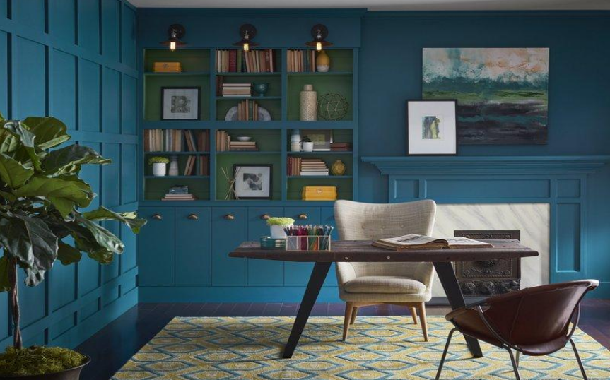
Blue is the most universally chosen favorite color. It crosses cultures, ages and genders and is often considered the “safe” color choice.  Choosing a saturated shade of blue with a small touch of green that can add depth and drama, Sherwin Williams pushed the “safe” envelope and added interest to this selection.  It can pair beautifully with yellow (as pictured) or a chartreuse or lime green for pop. It can also be softened with light and airy neutrals to give a more tranquil effect. Blue is a “cool” color and will make a room feel larger by causing the walls to visually recede.

Colors can have a psychological influence on us as well.  Blue can evoke many feeling such as calm tranquility (the sky), opulence (think “royal blue) and cleanliness.  Many corporations use blue in their logos to inspire trust. It is also the color of the 5th Chakra – the throat – which represents the ability to communicate effectively.

Please check out this interesting color online at Sherwin-Williams or at your local Sherwin Williams dealer.

If you would like any other information about this or any other design areas please contact me at liz@chrysalizdesign.com or call the office at 732 270-4546.

Liz Balogh   Chrysaliz Design,LLC

← LVT –What is it and is it right for me?Accent Walls-Why, Where and How →
Back to Top

email: liz@chrysalizdesign.com
phone: (732) 270-4546

Terms of Service/Privacy Policy