
To Sea or Not to Sea
When I met with my clients in their newly built home they were in a state of transition. Their previous home had been much older with smaller and clearly defined rooms. Their new construction was a much desired open floor plan but one which presented some challenges for them as they attempted to decorate.
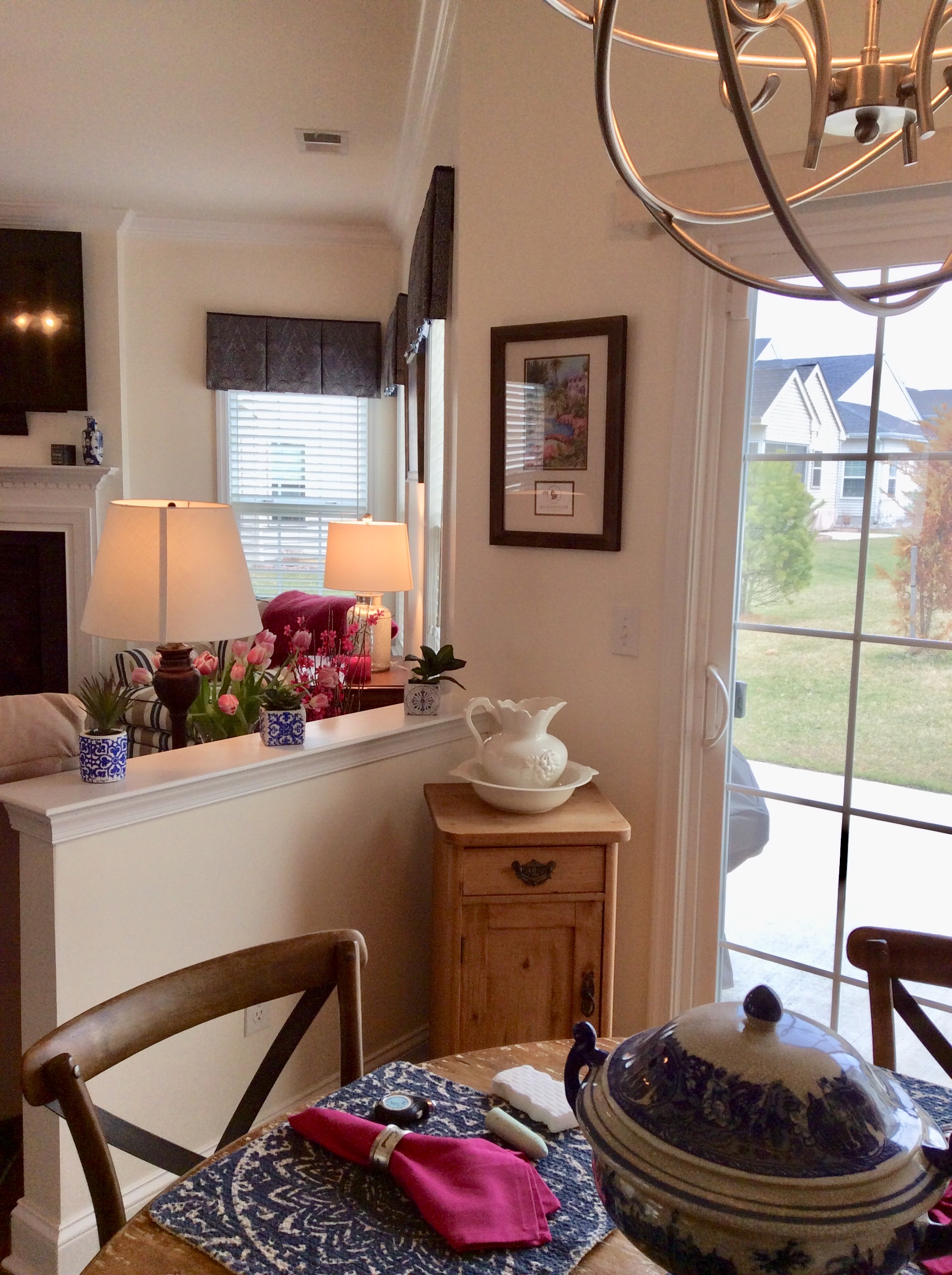
At our first meeting my clients expressed that while they were now living in a more coastal location they were torn over the idea of how to incorporate touches without a kitschy sea shore feel. They had also just had the whole house painted an off white (Benjamin Moore-Mayonnaise) color. While concerned over the lack of color, they did not want the expense or mess of repainting but wanted to add warmth and interest to the space.
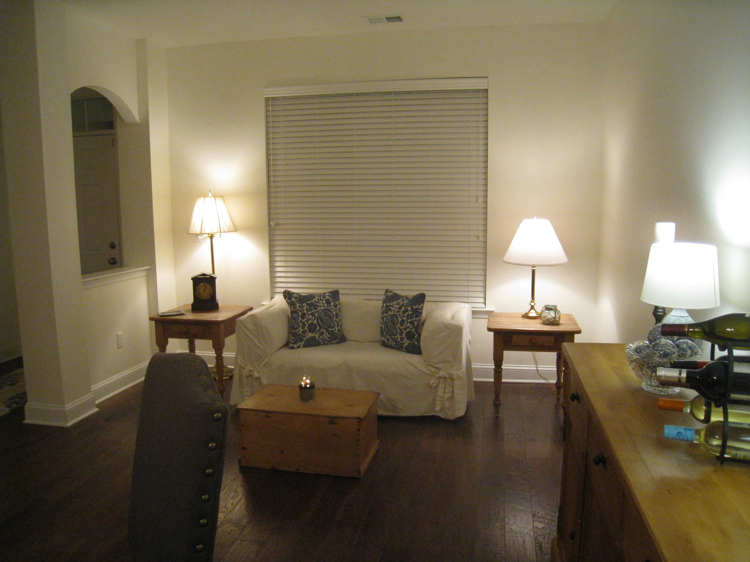
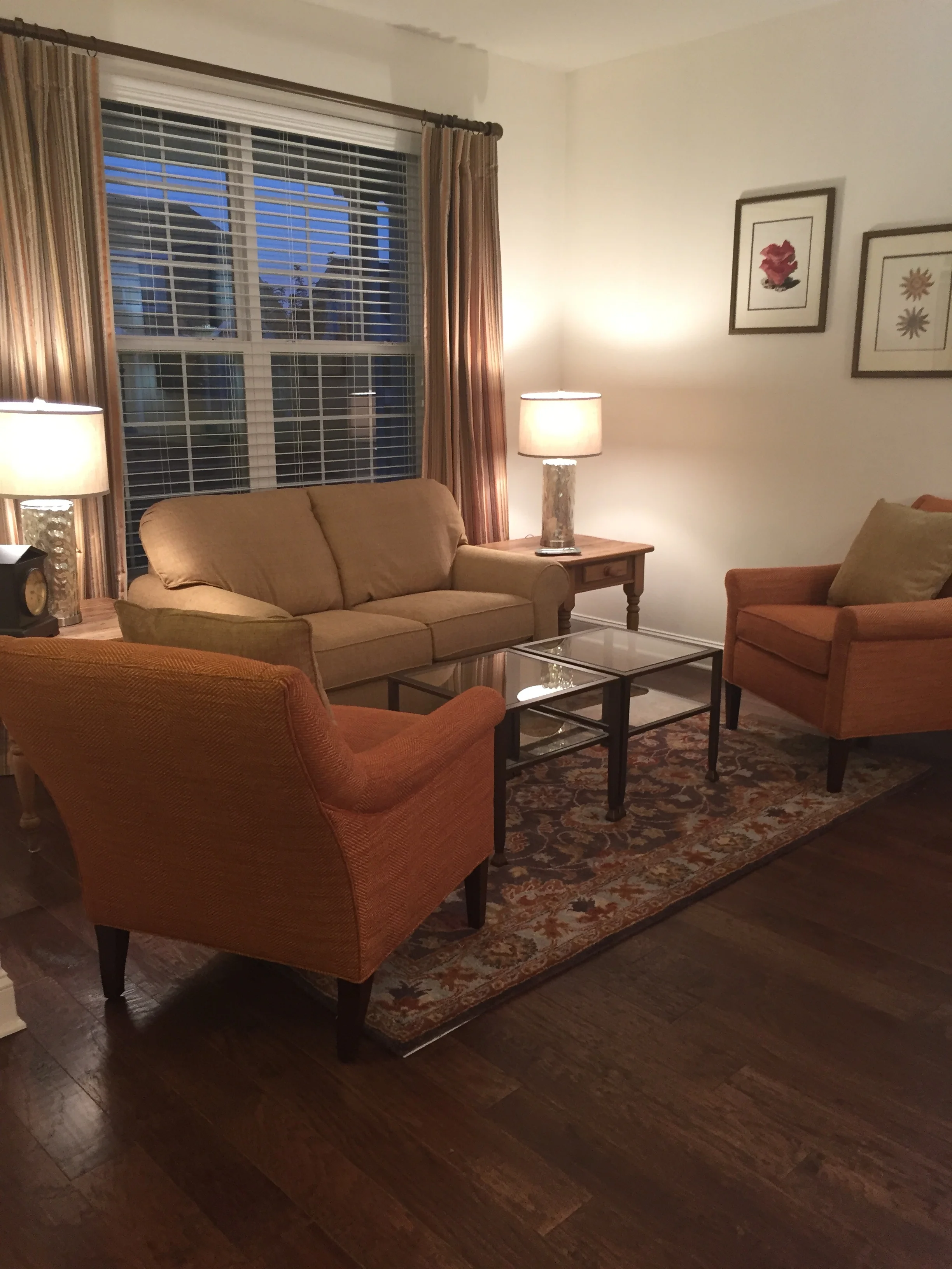
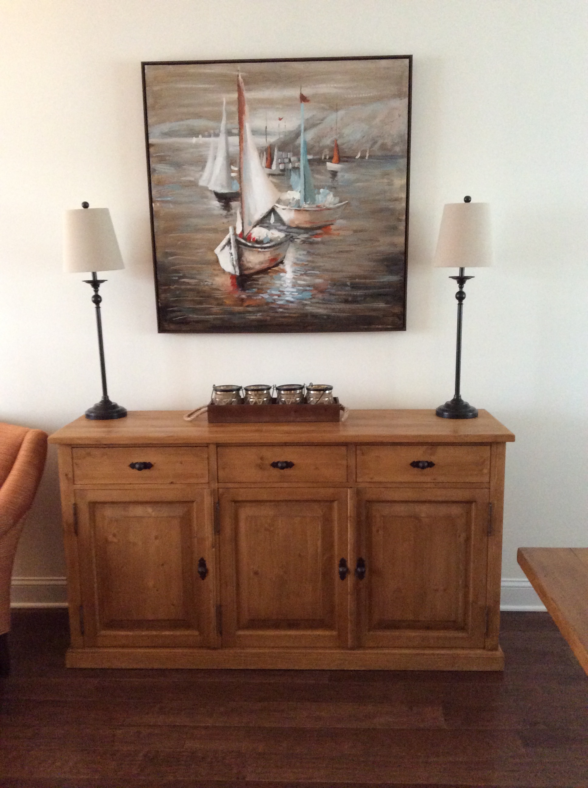
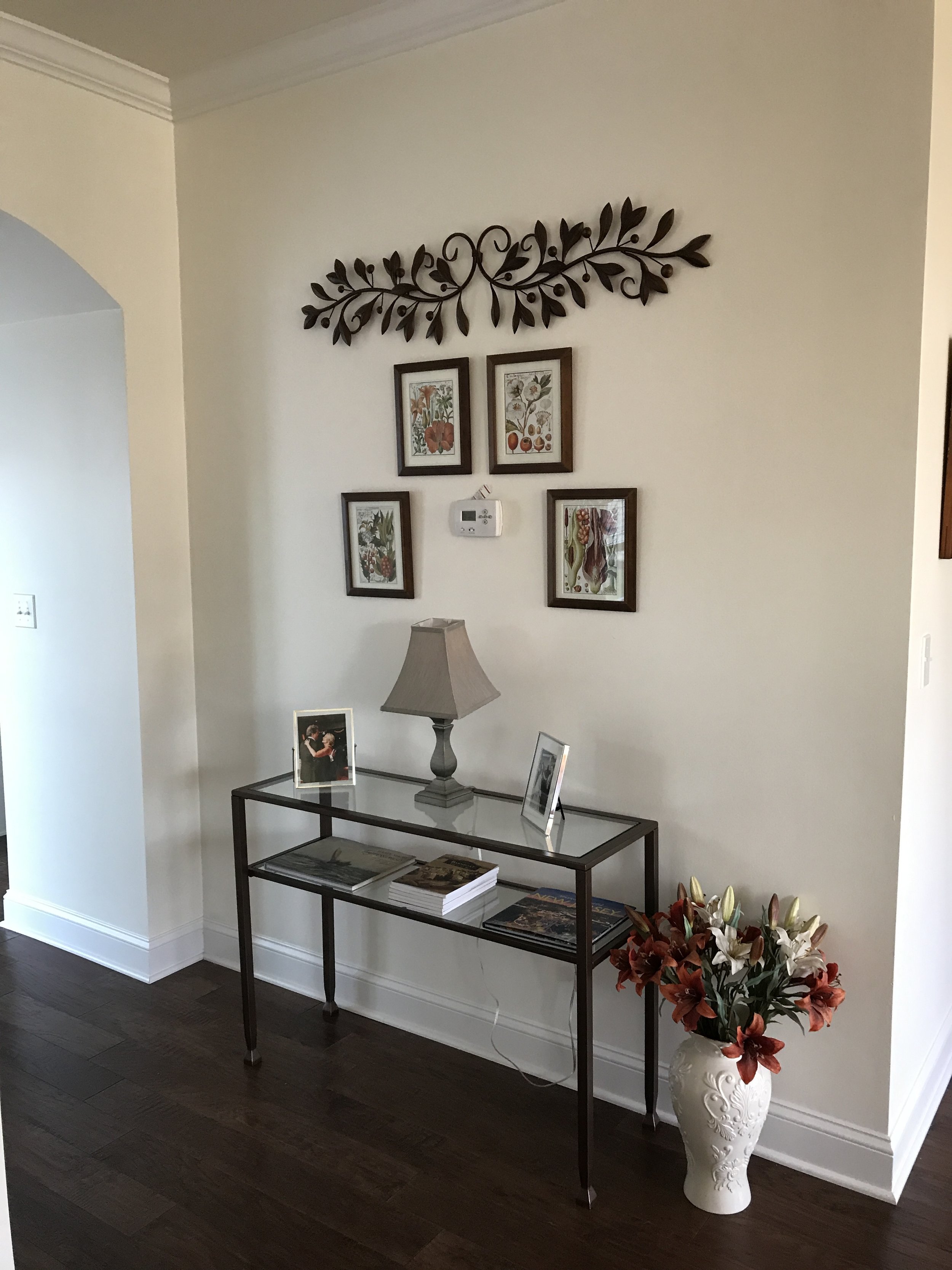
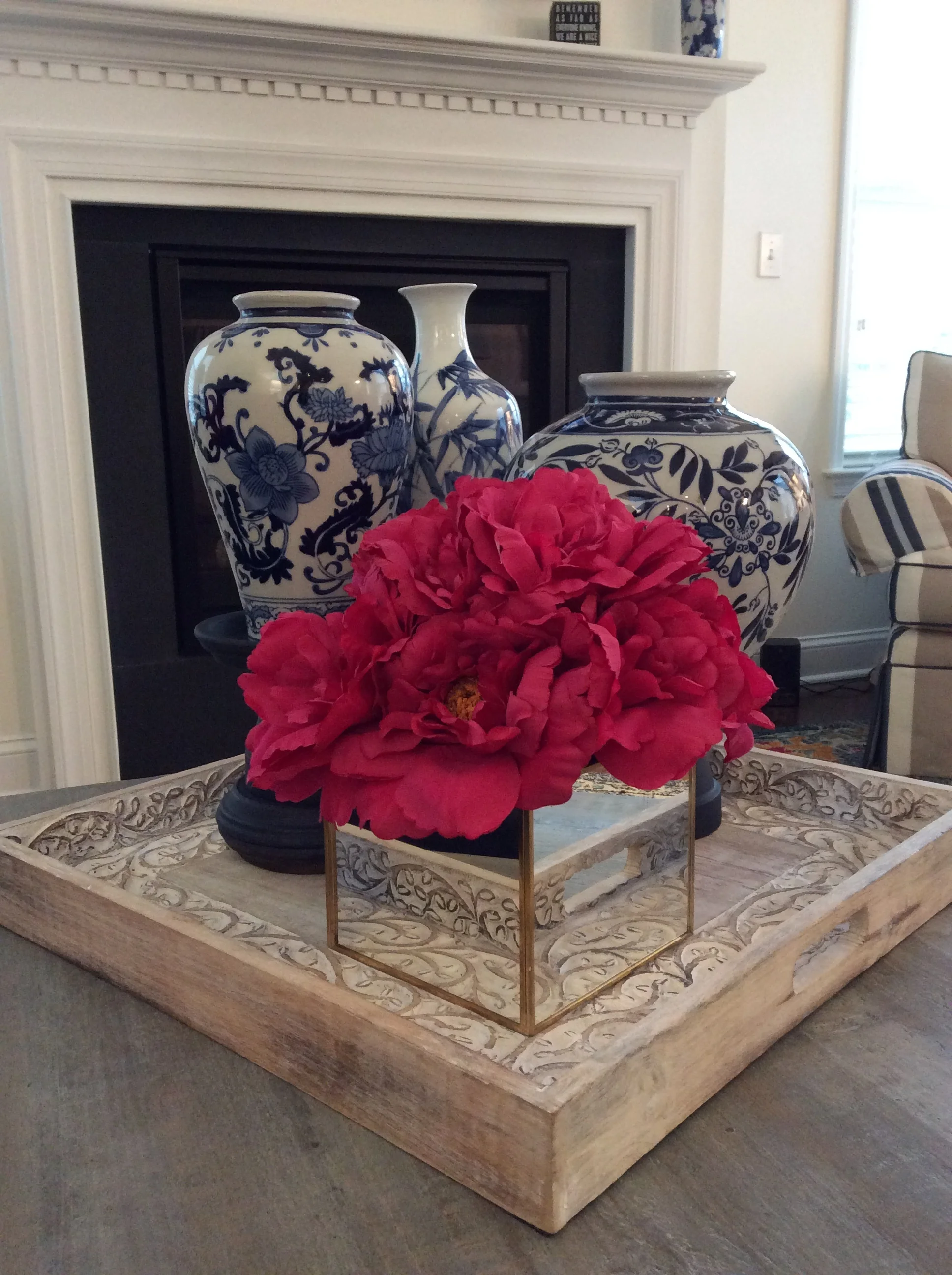
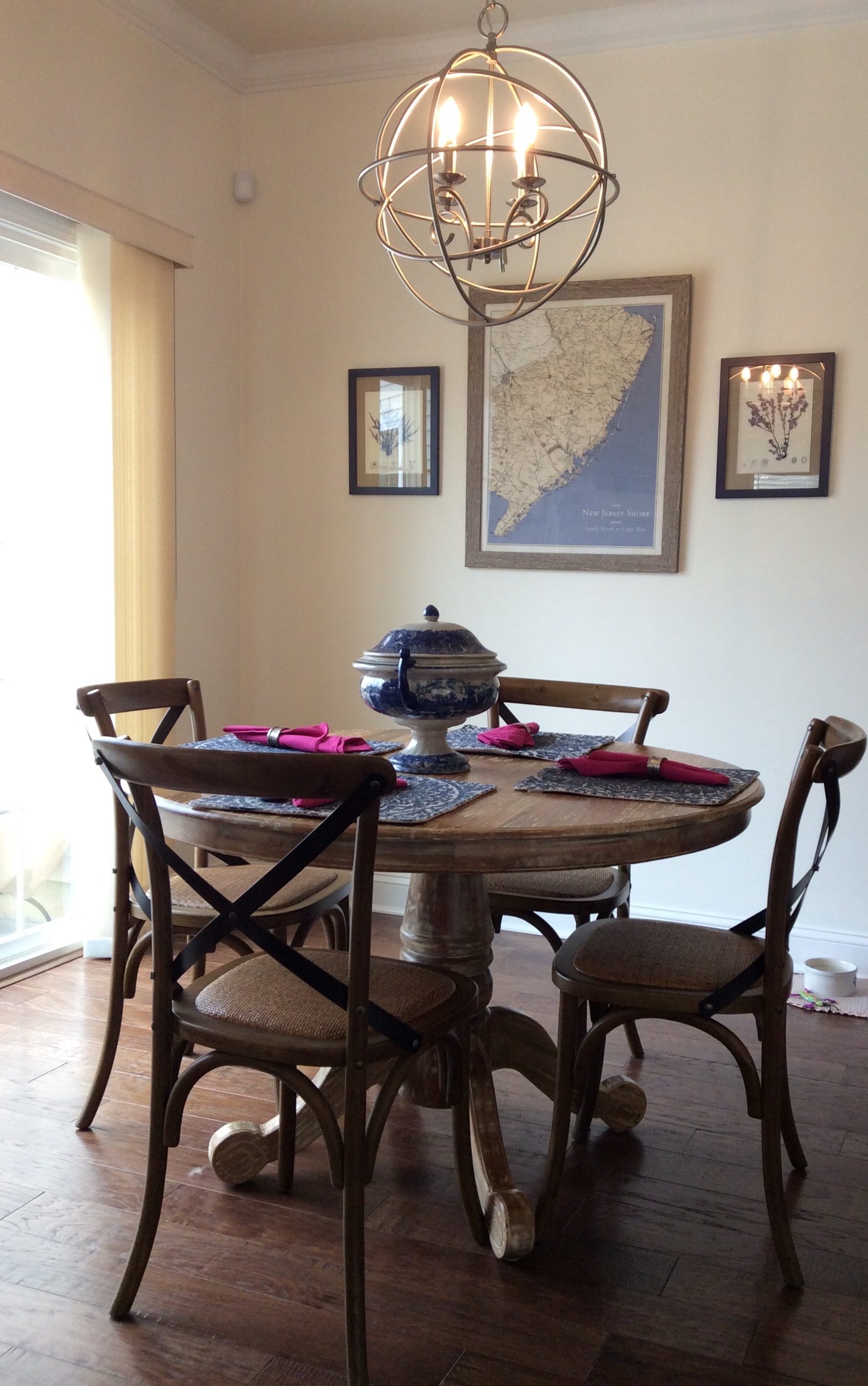
The only furniture investment they had made for their combination Living/Dining Room was a beautiful trestle dining table and chairs covered in grey linen from British Cottage in Red Bank, NJ. I began the design process by creating a dimensioned floor plan to determine what type of furniture pieces and the sizes which would be required in the space. From there we were able to develop a color palette that encompassed warm earth tones with spicy accents that would work well with the neutral wood and dining chair fabric. Finding an interesting and colorful area rug as our large scale pattern then allowed us to utilize the beautiful faux silk drapery fabric in a muted multicolored stripe. A small scale custom sofa in gold tones and 2 custom covered accent chairs in orange and gold chevron chenille created an inviting conversation area. Pulling in shades of blue in the rug and accents brings in the cooler tones and compliments the color palette. A pair of table lamps in mercury glass was placed on the end tables to add shine and small scale bunching tables in glass and oil rubbed bronze finish allow traffic to flow smoothly in the seating area while allowing the rug pattern to be seen. I walked the metal finish around the room using it in the drapery hardware, buffet style lamps and the new linear chandelier which hangs over the dining table. The oil painting of the sailboats hangs over the buffet and introduces a coastal theme using more nontraditional colors, playing beautifully into our warm color scheme. Pulling those tones out in a series of marine life botanicals allows us to allude to the sea without diving full force into it. A beautiful custom floral arrangement from Creative Displays, Inc of Tinton Falls and mercury glass candle holders are the perfect table top accents and draw you into this warm and inviting space.

My clients are thrilled with their beautiful and functional new Living/Dining Room. This nontraditional approach to a coastal look allows them to have the best of both style worlds.
If you would like any other information about this or any other design areas please contact me at liz@chrysalizdesign.com or call the office at 732 270-4546.
Liz Balogh Chrysaliz Design,LLC